Note
Go to the end to download the full example code.
Satellite Data Analysis#
Meteorological satellites can uniformly observe the distribution of clouds, water vapor, sea ice, etc. over a wide area, including oceans, deserts, and mountainous regions, where meteorological observations are difficult, and are extremely useful for monitoring the weather and climate of the entire planet, including the atmosphere, oceans, snow and ice. They are also a very effective means of observation for monitoring typhoons over the ocean. They also play a role in relaying meteorological data, tide data, seismic intensity data, etc. observed on ships and remote islands.
Before proceeding with all the steps, first import some necessary libraries and packages
import xarray as xr
import matplotlib.pyplot as plt
import cartopy.crs as ccrs
import easyclimate as ecl
Satellite data is measured by sensors to measure radiance, etc. After bias correction, the data is converted into physical quantities, coordinate transformation is performed, and the data is converted into a grid point for easy use before being provided. The level of data processing is called the level. Data with the original sensor resolution before processing is called level 0, data with corrections and spatiotemporal information added is called level 1, data converted into physical quantities is called level 2, data interpolated into a uniform space-time is called level 3, and data combining model output and multiple measurements is called level 4. Here, we use level 3 data from the meteorological satellite Himawari-9 (ひまわり9号).
The satellite data is loaded from a NetCDF file containing Himawari-9 observations. The decode_timedelta parameter is disabled as temporal data processing is not required.
Tip
You can download following datasets here: Download js_H09_20250617_0500.nc
js_data = xr.open_dataset("js_H09_20250617_0500.nc", decode_timedelta = False)
js_data
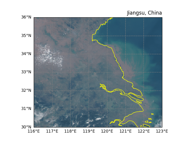
Visual Band#
A contrast-stretched RGB composite is created using albedo bands from the satellite data. The get_stretched_rgb_data function applies piecewise linear stretching to enhance contrast:
Band 3 (0.64μm) for Red channel
Band 2 (0.51μm) for Green channel
Band 1 (0.47μm) for Blue channel
rgb_result = ecl.field.satellite.get_stretched_rgb_data(js_data, r_band='albedo_03', g_band='albedo_02', b_band='albedo_01')
rgb_result
The RGB composite is plotted on a geographic projection with cartographic elements:
Plate Carrée projection for global/regional views
10m resolution coastlines in yellow for land demarcation
Grey dashed gridlines with latitude/longitude labels
fig, ax = plt.subplots(subplot_kw={"projection": ccrs.PlateCarree()})

ax.coastlines(resolution="10m", color = 'yellow')
ax.gridlines(draw_labels=["left", "bottom"], color="grey", linestyle="--")
ax.set_title("Jiangsu, China", loc = 'right')

# The RGB data is displayed using Plate Carrée coordinate transformation
# to ensure proper georeferencing of the satellite imagery
rgb_result.plot.imshow(ax = ax, transform=ccrs.PlateCarree())
<matplotlib.image.AxesImage object at 0x7f91b7dd3050>
Total running time of the script: (0 minutes 2.288 seconds)