Note
Go to the end to download the full example code.
Basic Statistical Analysis#
Before proceeding with all the steps, first import some necessary libraries and packages
import easyclimate as ecl
import matplotlib.pyplot as plt
import cartopy.crs as ccrs
Obtain the sea ice concentration (SIC) data from the Barents-Kara Seas (30°−90°E, 65°−85°N).
See also
Luo, B., Luo, D., Ge, Y. et al. Origins of Barents-Kara sea-ice interannual variability modulated by the Atlantic pathway of El Niño–Southern Oscillation. Nat Commun 14, 585 (2023). https://doi.org/10.1038/s41467-023-36136-5
sic_data_Barents_Sea = ecl.open_tutorial_dataset("mini_HadISST_ice").sic
sic_data_Barents_Sea
And tropical SST dataset.
See also
Rayner, N. A.; Parker, D. E.; Horton, E. B.; Folland, C. K.; Alexander, L. V.; Rowell, D. P.; Kent, E. C.; Kaplan, A. (2003) Global analyses of sea surface temperature, sea ice, and night marine air temperature since the late nineteenth century J. Geophys. Res.Vol. 108, No. D14, 4407 https://doi.org/10.1029/2002JD002670 (pdf ~9Mb)
Mean States for Special Month#
easyclimate.get_specific_months_data allows us to easily obtain data on the SIC for December alone.
sic_data_Barents_Sea_12 = ecl.get_specific_months_data(sic_data_Barents_Sea, 12)
sic_data_Barents_Sea_12
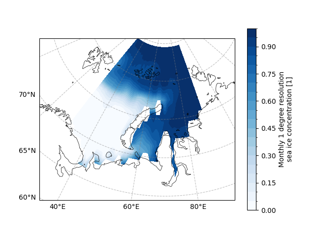
Now we try to draw the mean states of the SIC in the Barents-Kara for the December.
draw_sic_mean_state = sic_data_Barents_Sea_12.mean(dim="time")

fig, ax = plt.subplots(
    subplot_kw={
        "projection": ccrs.Orthographic(central_longitude=70, central_latitude=70)
    }
)

ax.gridlines(draw_labels=["bottom", "left"], color="grey", alpha=0.5, linestyle="--")
ax.coastlines(edgecolor="black", linewidths=0.5)

draw_sic_mean_state.plot.contourf(
    ax=ax,
    # projection on data
    transform=ccrs.PlateCarree(),
    # Colorbar is placed at the bottom
    cbar_kwargs={"location": "right"},
    cmap="Blues",
    levels=21,
)
<cartopy.mpl.contour.GeoContourSet object at 0x7fe72e9d5d20>
Linear Trend#
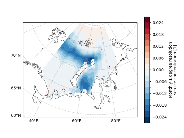
As we all know, the area of Arctic sea ice has been decreasing more and more in recent years
due to the impact of global warming. We can obtain the change of SIC by solving
the linear trend of SIC data from 1981-2022.
easyclimate.calc_linregress_spatial can provide the calculation
results of solving the linear trend for each grid point.
sic_data_Barents_Sea_12_linear_trend = ecl.calc_linregress_spatial(
    sic_data_Barents_Sea_12, dim="time"
).compute()
sic_data_Barents_Sea_12_linear_trend
The slope is our desired linear trend, let’s try to plot the linear trend of each grid point.
draw_sic_slope = sic_data_Barents_Sea_12_linear_trend.slope

fig, ax = plt.subplots(
    subplot_kw={
        "projection": ccrs.Orthographic(central_longitude=70, central_latitude=70)
    }
)

ax.gridlines(draw_labels=["bottom", "left"], color="grey", alpha=0.5, linestyle="--")
ax.coastlines(edgecolor="black", linewidths=0.5)

draw_sic_slope.plot.contourf(
    ax=ax,
    transform=ccrs.PlateCarree(),
    cbar_kwargs={"location": "right"},
    cmap="RdBu_r",
    levels=21,
)
<cartopy.mpl.contour.GeoContourSet object at 0x7fe72e292950>
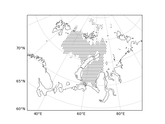
The pvalue is the corresponding p-value, and we can determine a significance level (e.g., significance level is set to 0.05) in order to plot the region of significance.
draw_sic_pvalue = sic_data_Barents_Sea_12_linear_trend.pvalue

fig, ax = plt.subplots(
    subplot_kw={
        "projection": ccrs.Orthographic(central_longitude=70, central_latitude=70)
    }
)

ax.gridlines(draw_labels=["bottom", "left"], color="grey", alpha=0.5, linestyle="--")
ax.coastlines(edgecolor="black", linewidths=0.5)

ecl.plot.draw_significant_area_contourf(
    draw_sic_pvalue, ax=ax, thresh=0.05, transform=ccrs.PlateCarree()
)
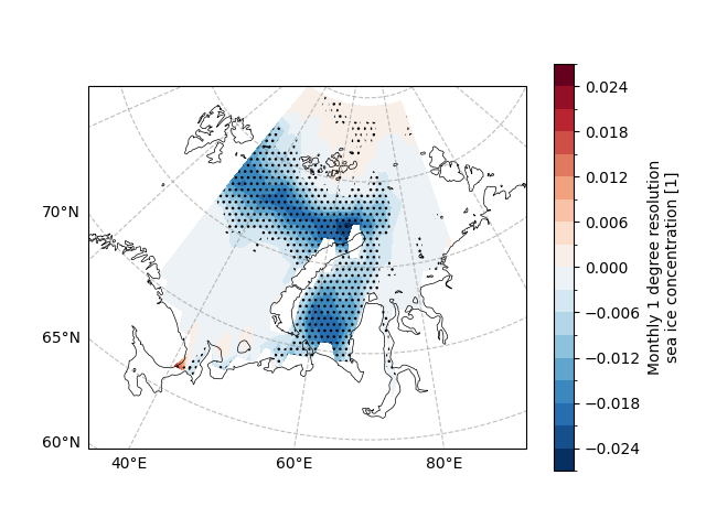
Further, we can superimpose the linear trend and the region of significance to study the linear trend of the region of significance (since the linear trend of the region of non-significance is often spurious).
fig, ax = plt.subplots(
    subplot_kw={
        "projection": ccrs.Orthographic(central_longitude=70, central_latitude=70)
    }
)

ax.gridlines(draw_labels=["bottom", "left"], color="grey", alpha=0.5, linestyle="--")
ax.coastlines(edgecolor="black", linewidths=0.5)

# SIC slope
draw_sic_slope.plot.contourf(
    ax=ax,
    transform=ccrs.PlateCarree(),
    cbar_kwargs={"location": "right"},
    cmap="RdBu_r",
    levels=21,
)

# SIC 95% significant level
ecl.plot.draw_significant_area_contourf(
    draw_sic_pvalue, ax=ax, thresh=0.05, transform=ccrs.PlateCarree()
)
Regression#
Regression analysis is a statistical technique used to investigate the connection between a dependent variable and one or more independent variables.
It is frequently employed in climatology to analyze trends and patterns in climatic data, identify correlations between different climatic parameters, and create models that can predict future changes. By identifying patterns and connections in massive datasets, regression analysis offers several benefits for weather research. For instance, regression analysis can be used to pinpoint the elements that affect global temperatures, such as solar radiation, atmospheric greenhouse gases, and volcanic eruptions. Climate scientists can create models that can accurately predict future changes by including these variables in a regression model.
Moreover, regression analysis can assist climate experts in spotting natural fluctuations in climate data, like El Niño events, and in determining how human activities like deforestation and fossil fuel combustion affect the environment. Regression analysis can also evaluate the effectiveness of various mitigation tactics, such as carbon pricing policies or renewable energy initiatives.
Overall, regression analysis is a potent tool for analyzing complex climate data and producing reliable projections of upcoming alterations.
See also
Regression Analysis: Definition, Types, Usage & Advantages. Website: https://www.questionpro.com/blog/regression-analysis/
The Advantages of Regression Analysis & Forecasting. Website: https://smallbusiness.chron.com/advantages-regression-analysis-forecasting-61800.html
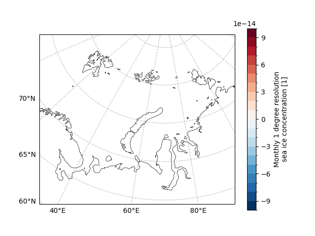
In this subsection we try to regress the Niño 3.4 index on the Barents-Kara December SIC data.
Before performing the regression analysis, we can see that the longitude range of the SST data is -180°~180°,
try to convert the longitude range to 0°~360° using easyclimate.utility.transfer_xarray_lon_from180TO360.
sst_data_0_360 = ecl.utility.transfer_xarray_lon_from180TO360(sst_data)
sst_data_0_360
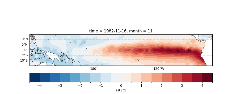
Further, easyclimate.remove_seasonal_cycle_mean is used to remove the climate state of each
month in order to obtain the individual month anomalies.
The figure below illustrates the November SST anomaly in the tropical equatorial Pacific during the 1982-83 super El Niño.
See also
Philander, S. Meteorology: Anomalous El Niño of 1982–83. Nature 305, 16 (1983). https://doi.org/10.1038/305016a0
sst_data_anormaly = ecl.remove_seasonal_cycle_mean(sst_data_0_360)

fig, ax = plt.subplots(
    figsize=(10, 4), subplot_kw={"projection": ccrs.PlateCarree(central_longitude=180)}
)

sst_data_anormaly.sel(lon=slice(120, 290)).isel(time=22).plot.contourf(
    ax=ax,
    transform=ccrs.PlateCarree(),
    cbar_kwargs={"location": "bottom", "pad": 0.1},
    cmap="RdBu_r",
    levels=21,
)

ax.gridlines(draw_labels=["bottom", "left"], color="grey", alpha=0.5, linestyle="--")
ax.coastlines(edgecolor="black", linewidths=0.5)
<cartopy.mpl.feature_artist.FeatureArtist object at 0x7fe72eabf850>
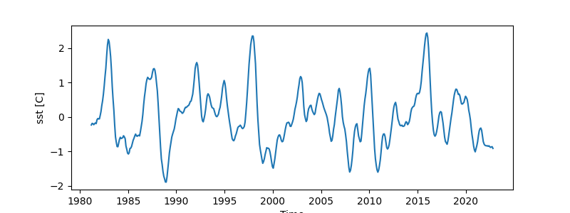
The Niño3.4 index is commonly used as an indicator for detecting ENSO,
and easyclimate provides easyclimate.field.air_sea_interaction.calc_index_nino34 to calculate the index using SST original dataset.
See also
Anthony G. Bamston, Muthuvel Chelliah & Stanley B. Goldenberg (1997) Documentation of a highly ENSO‐related sst region in the equatorial pacific: Research note, Atmosphere-Ocean, 35:3, 367-383, DOI: https://doi.org/10.1080/07055900.1997.9649597
nino34_monthly_index = ecl.field.air_sea_interaction.calc_index_nino34(sst_data_0_360)

nino34_monthly_index.plot(
    figsize=(8, 3),
)
[<matplotlib.lines.Line2D object at 0x7fe72e101a50>]
easyclimate.calc_yearly_climatological_mean is then used to solve for the annual average of the monthly index data
nino34_12_index = ecl.get_specific_months_data(nino34_monthly_index, 12)
nino34_dec_yearly_index = ecl.calc_yearly_climatological_mean(nino34_12_index)
nino34_dec_yearly_index
Unlike solving for linear trend without passing in x, regression analysis must use the parameter x to pass in the object to be regressed. Care must be taken to ensure that the time dimensions are identical.
sic_reg_nino34 = ecl.calc_linregress_spatial(
    sic_data_Barents_Sea_12, x=nino34_dec_yearly_index.data
)
sic_reg_nino34 = sic_reg_nino34.compute()
sic_reg_nino34
/home/runner/work/easyclimate/easyclimate/src/easyclimate/core/stat.py:104: UserWarning: Assuming that the coordinate value of 'time' in `data_input` and `x` is same. Ignoring.
  warnings.warn(
Here is an attempt to plot the results of the regression analysis.
draw_sic_slope = sic_reg_nino34.slope
draw_sic_pvalue = sic_reg_nino34.pvalue

fig, ax = plt.subplots(
    subplot_kw={
        "projection": ccrs.Orthographic(central_longitude=70, central_latitude=70)
    }
)

ax.gridlines(draw_labels=["bottom", "left"], color="grey", alpha=0.5, linestyle="--")
ax.coastlines(edgecolor="black", linewidths=0.5)

draw_sic_slope.plot.contourf(
    ax=ax,
    transform=ccrs.PlateCarree(),
    cbar_kwargs={"location": "right"},
    cmap="RdBu_r",
    levels=21,
)

ecl.plot.draw_significant_area_contourf(
    draw_sic_pvalue, ax=ax, thresh=0.05, transform=ccrs.PlateCarree()
)
Detrend#
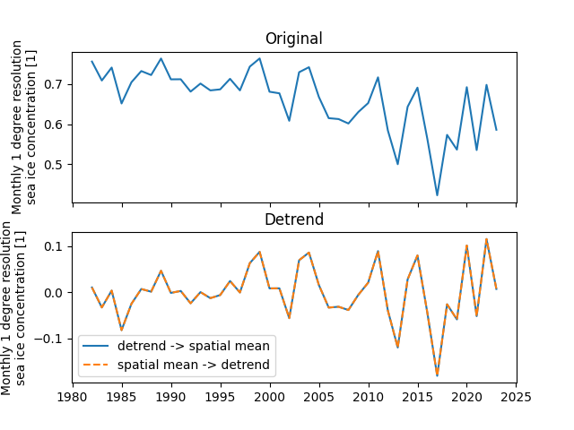
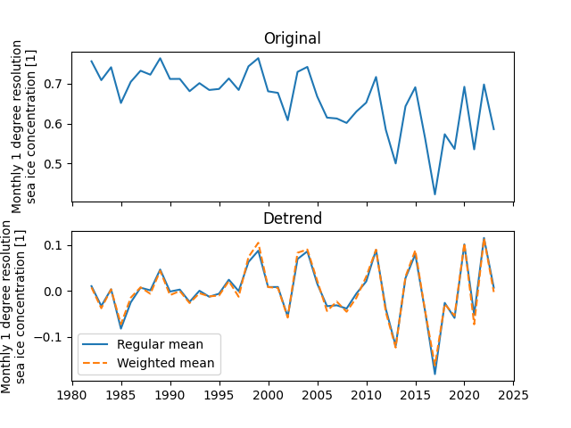
Sea ice area shows an approximately linear trend of decreasing due to global warming. We remove the linear trend from SIC in order to study the variability of SIC itself. In addition, here we explore the differences between the trend followed by regional averaging and regional averaging followed by detrending approaches.
sic_data_Barents_Sea_12_spatial_mean = sic_data_Barents_Sea_12.mean(dim=("lat", "lon"))
sic_data_Barents_Sea_12_spatial_detrendmean = ecl.calc_detrend_spatial(
    sic_data_Barents_Sea_12, time_dim="time"
).mean(dim=("lat", "lon"))
sic_data_Barents_Sea_12_time_detrendmean = ecl.calc_detrend_spatial(
    sic_data_Barents_Sea_12_spatial_mean, time_dim="time"
)
The results show that there is no significant difference between these two detrending methods to study the variability of SIC in the Barents-Kara Seas.
fig, ax = plt.subplots(2, 1, sharex=True)

sic_data_Barents_Sea_12_spatial_mean.plot(ax=ax[0])
ax[0].set_xlabel("")
ax[0].set_title("Original")


sic_data_Barents_Sea_12_spatial_detrendmean.plot(
    ax=ax[1], label="detrend -> spatial mean"
)
sic_data_Barents_Sea_12_time_detrendmean.plot(
    ax=ax[1], ls="--", label="spatial mean -> detrend"
)
ax[1].set_xlabel("")
ax[1].set_title("Detrend")
ax[1].legend()
<matplotlib.legend.Legend object at 0x7fe72e355cc0>
Weighted Spatial Data#
When calculating regional averages in high-latitude areas, considering weights is necessary because regions at different latitudes cover unequal surface areas on the Earth. Since the Earth is approximately a spheroid, areas closer to the poles have a different distribution of surface area on the spherical surface.
One common way to incorporate weights is by using the cosine of latitude, i.e., multiplying by \(\cos (\varphi)\), where \(\varphi\) represents the latitude of a location. This is because areas at higher latitudes, close to the poles, have higher latitudes and smaller cosine values, allowing for a smaller weight to be applied to these regions when calculating averages.
In summary, considering weights is done to more accurately account for the distribution of surface area on the Earth, ensuring that contributions from different regions are weighted according to their actual surface area when calculating averages or other regional statistical measures.
easyclimate.utility.get_weighted_spatial_data can help us create
an xarray.core.weighted.DataArrayWeighted object.
This object will automatically consider and calculate weights in subsequent area operations, thereby achieving the operation of the weighted spatial average.
sic_data_Barents_Sea_12_detrend = ecl.calc_detrend_spatial(
    sic_data_Barents_Sea_12, time_dim="time"
)
grid_detrend_data_weighted_obj = ecl.utility.get_weighted_spatial_data(
    sic_data_Barents_Sea_12_detrend, lat_dim="lat", lon_dim="lon"
)
print(type(grid_detrend_data_weighted_obj))
<class 'xarray.core.weighted.DataArrayWeighted'>
Solve for regional averaging for grid_detrend_data_weighted_obj objects (the role of weights is considered at this point)
We can find some differences between the data considering latitude weights and those not considering latitude weights.
fig, ax = plt.subplots(2, 1, sharex=True)

sic_data_Barents_Sea_12_spatial_mean.plot(ax=ax[0])
ax[0].set_xlabel("")
ax[0].set_title("Original")


sic_data_Barents_Sea_12_spatial_detrendmean.plot(ax=ax[1], label="Regular mean")
sic_data_Barents_Sea_12_spatial_detrend_weightedmean.plot(
    ax=ax[1], ls="--", label="Weighted mean"
)
ax[1].set_xlabel("")
ax[1].set_title("Detrend")
ax[1].legend()
fig.show()
Skewness#
Skewness is a measure of the asymmetry of a probability distribution.
It quantifies the extent to which a distribution deviates from being symmetric around its mean. A distribution with a skewness value of zero is considered symmetric, meaning that it has equal probabilities of occurring above and below its mean. However, when the skewness value is non-zero, the distribution becomes asymmetric, indicating that there is a higher likelihood of occurrence on one side of the mean than the other.
Skewness can be positive or negative, depending on whether the distribution is skewed towards larger or smaller values.
In climate analysis, skewness can arise due to various factors such as changes in atmospheric circulation patterns, uneven temperature or precipitation distributions, or differences in measurement instruments.
See also
Distributions of Daily Meteorological Variables: Background. Website: https://psl.noaa.gov/data/atmoswrit/distributions/background/index.html
Bakouch HS, Cadena M, Chesneau C. A new class of skew distributions with climate data analysis. J Appl Stat. 2020 Jul 13;48(16):3002-3024. doi: https://doi.org/10.1080/02664763.2020.1791804. PMID: 35707257; PMCID: PMC9042114.
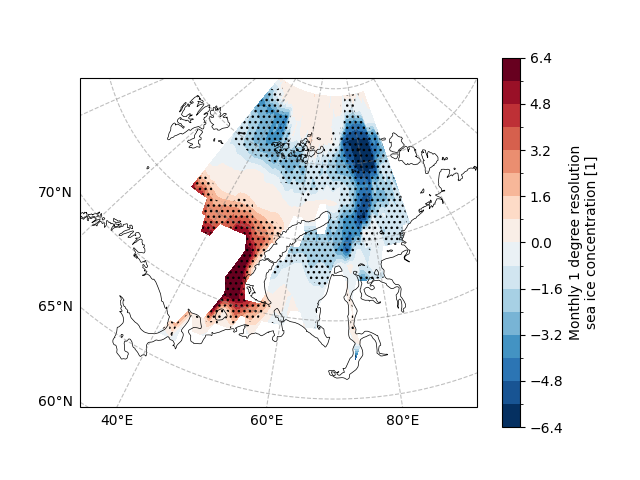
The skewness is calculated using easyclimate.calc_skewness_spatial.
The result of the calculation contains the skewness and p-value.
sic_data_Barents_Sea_12_detrend = ecl.calc_detrend_spatial(
    sic_data_Barents_Sea_12, time_dim="time"
)
sic_data_Barents_Sea_12_skew = ecl.calc_skewness_spatial(
    sic_data_Barents_Sea_12_detrend, dim="time"
)
sic_data_Barents_Sea_12_skew
fig, ax = plt.subplots(
    subplot_kw={
        "projection": ccrs.Orthographic(central_longitude=70, central_latitude=70)
    }
)

ax.gridlines(draw_labels=["bottom", "left"], color="grey", alpha=0.5, linestyle="--")
ax.coastlines(edgecolor="black", linewidths=0.5)

# SIC slope
sic_data_Barents_Sea_12_skew.skewness.plot.contourf(
    ax=ax,
    transform=ccrs.PlateCarree(),
    cbar_kwargs={"location": "right"},
    cmap="RdBu_r",
    levels=21,
)

# SIC 95% significant level
ecl.plot.draw_significant_area_contourf(
    sic_data_Barents_Sea_12_skew.pvalue,
    ax=ax,
    thresh=0.05,
    transform=ccrs.PlateCarree(),
)
Kurtosis#
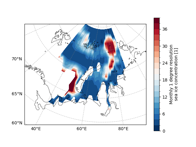
Kurtosis is a measure of the “tailedness” of a probability distribution. It describes how heavy or light the tails of a distribution are relative to a standard normal distribution. A distribution with high kurtosis has heavier tails and a greater propensity for extreme events, whereas a distribution with low kurtosis has lighter tails and fewer extreme events. Kurtosis is particularly useful in climate analysis because it can reveal information about the frequency and intensity of extreme weather events such as hurricanes, droughts, or heatwaves.
See also
Distributions of Daily Meteorological Variables: Background. Website: https://psl.noaa.gov/data/atmoswrit/distributions/background/index.html
Bakouch HS, Cadena M, Chesneau C. A new class of skew distributions with climate data analysis. J Appl Stat. 2020 Jul 13;48(16):3002-3024. doi: https://doi.org/10.1080/02664763.2020.1791804. PMID: 35707257; PMCID: PMC9042114.
The skewness is calculated using easyclimate.calc_kurtosis_spatial.
sic_data_Barents_Sea_12_kurt = ecl.calc_kurtosis_spatial(
    sic_data_Barents_Sea_12_detrend, dim="time"
)
sic_data_Barents_Sea_12_kurt
Consider plotting kurtosis below
fig, ax = plt.subplots(
    subplot_kw={
        "projection": ccrs.Orthographic(central_longitude=70, central_latitude=70)
    }
)

ax.gridlines(draw_labels=["bottom", "left"], color="grey", alpha=0.5, linestyle="--")
ax.coastlines(edgecolor="black", linewidths=0.5)

# SIC slope
sic_data_Barents_Sea_12_kurt.plot.contourf(
    ax=ax,
    transform=ccrs.PlateCarree(),
    cbar_kwargs={"location": "right"},
    cmap="RdBu_r",
    levels=21,
)
<cartopy.mpl.contour.GeoContourSet object at 0x7fe72e01a110>
Composite Analysis#
In the process of climate analysis, composite analysis is a statistical and integrative method used to study the spatial and temporal distribution of specific climate events or phenomena. The primary purpose of this analysis method is to identify common features and patterns among multiple events or time periods by combining their information.
Specifically, the steps of composite analysis typically include the following aspects:
Event Selection: Firstly, a set of events related to the research objective is chosen. These events could be specific climate phenomena such as heavy rainfall, drought, or temperature anomalies.
Data Collection: Collect meteorological data related to the selected events, including observational data, model outputs, or remote sensing data.
Event Alignment: Time-align the chosen events to ensure that they are within the same temporal framework for analysis.
Data Combination: Combine data values at corresponding time points into a composite dataset. Averages or weighted averages are often used to reduce the impact of random noise.
The advantages of this method include:
Highlighting Common Features: By combining data from multiple events or time periods, composite analysis can highlight common features, aiding in the identification of general patterns in climate events.
Noise Reduction: By averaging data, composite analysis helps to reduce the impact of random noise, resulting in more stable and reliable analysis outcomes.
Spatial Consistency: Through spatial averaging, this method helps reveal the consistent spatial distribution of climate events, providing a more comprehensive understanding.
Facilitating Comparisons: Composite analysis makes it convenient to compare different events or time periods as it integrates them into a unified framework.
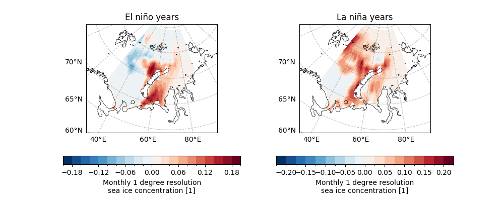
Here we try to extract the El Niño and La Niña events using the standard deviation of the Niño 3.4 index as a threshold.
nino34_dec_yearly_index_std = nino34_dec_yearly_index.std(dim="time").data
nino34_dec_yearly_index_std
array(1.0746759, dtype=float32)
easyclimate.get_year_exceed_index_upper_bound is able to obtain the years that exceed the upper bound of the Niño 3.4 exponential threshold,
and similarly easyclimate.get_year_exceed_index_lower_bound can obtain the years that exceed the lower bound of the exponential threshold.
elnino_year = ecl.get_year_exceed_index_upper_bound(
    nino34_dec_yearly_index, thresh=nino34_dec_yearly_index_std
)
lanina_year = ecl.get_year_exceed_index_lower_bound(
    nino34_dec_yearly_index, thresh=-nino34_dec_yearly_index_std
)
print("El niño years: ", elnino_year)
print("La niña years: ", lanina_year)
El niño years:  [1982 1986 1991 1997 2002 2009 2015]
La niña years:  [1988 1998 1999 2007 2010]
Further we use easyclimate.get_specific_years_data to extract data
for the El Niño years within sic_data_Barents_Sea_12_detrend. The results show that six temporal levels were extracted.
sic_data_Barents_Sea_12_detrend_elnino = ecl.get_specific_years_data(
    sic_data_Barents_Sea_12_detrend, elnino_year
)
sic_data_Barents_Sea_12_detrend_elnino.name = "El niño years"
sic_data_Barents_Sea_12_detrend_lanina = ecl.get_specific_years_data(
    sic_data_Barents_Sea_12_detrend, lanina_year
)
sic_data_Barents_Sea_12_detrend_lanina.name = "La niña years"
sic_data_Barents_Sea_12_detrend_elnino
Similarly, 5 temporal levels were extracted for the La Niña years.
We now plot the distribution of SIC during El Niño and La Niña years.
fig, ax = plt.subplots(
    1,
    2,
    subplot_kw={
        "projection": ccrs.Orthographic(central_longitude=70, central_latitude=70)
    },
    figsize=(10, 4),
)

for axi in ax.flat:
    axi.gridlines(
        draw_labels=["bottom", "left"], color="grey", alpha=0.5, linestyle="--"
    )
    axi.coastlines(edgecolor="black", linewidths=0.5)

sic_data_Barents_Sea_12_detrend_elnino.mean(dim="time").plot.contourf(
    ax=ax[0],
    transform=ccrs.PlateCarree(),
    cbar_kwargs={"location": "bottom"},
    cmap="RdBu_r",
    levels=21,
)
ax[0].set_title("El niño years")

sic_data_Barents_Sea_12_detrend_lanina.mean(dim="time").plot.contourf(
    ax=ax[1],
    transform=ccrs.PlateCarree(),
    cbar_kwargs={"location": "bottom"},
    cmap="RdBu_r",
    levels=21,
)
ax[1].set_title("La niña years")
Text(0.5, 1.0, 'La niña years')
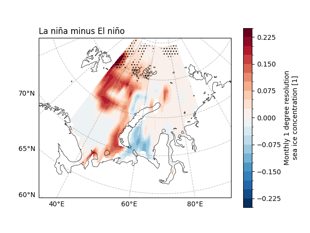
So is there a significant difference in the distribution of SIC between these two events?
easyclimate.calc_ttestSpatialPattern_spatial provides a
two-sample t-test operation to investigate whether there is a significant difference between the means of the two samples.
sig_diff = ecl.calc_ttestSpatialPattern_spatial(
    sic_data_Barents_Sea_12_detrend_elnino,
    sic_data_Barents_Sea_12_detrend_lanina,
    dim="time",
)
sig_diff
We can find that there is little difference in the effect on SIC under different ENSO events.
fig, ax = plt.subplots(
    subplot_kw={
        "projection": ccrs.Orthographic(central_longitude=70, central_latitude=70)
    }
)

ax.gridlines(draw_labels=["bottom", "left"], color="grey", alpha=0.5, linestyle="--")
ax.coastlines(edgecolor="black", linewidths=0.5)

# SIC slope
diff = sic_data_Barents_Sea_12_detrend_lanina.mean(
    dim="time"
) - sic_data_Barents_Sea_12_detrend_elnino.mean(dim="time")
diff.plot.contourf(
    ax=ax,
    transform=ccrs.PlateCarree(),
    cbar_kwargs={"location": "right"},
    cmap="RdBu_r",
    levels=21,
)

ax.set_title("La niña minus El niño", loc="left")

ecl.plot.draw_significant_area_contourf(
    sig_diff.pvalue, ax=ax, thresh=0.1, transform=ccrs.PlateCarree()
)
Total running time of the script: (0 minutes 15.349 seconds)